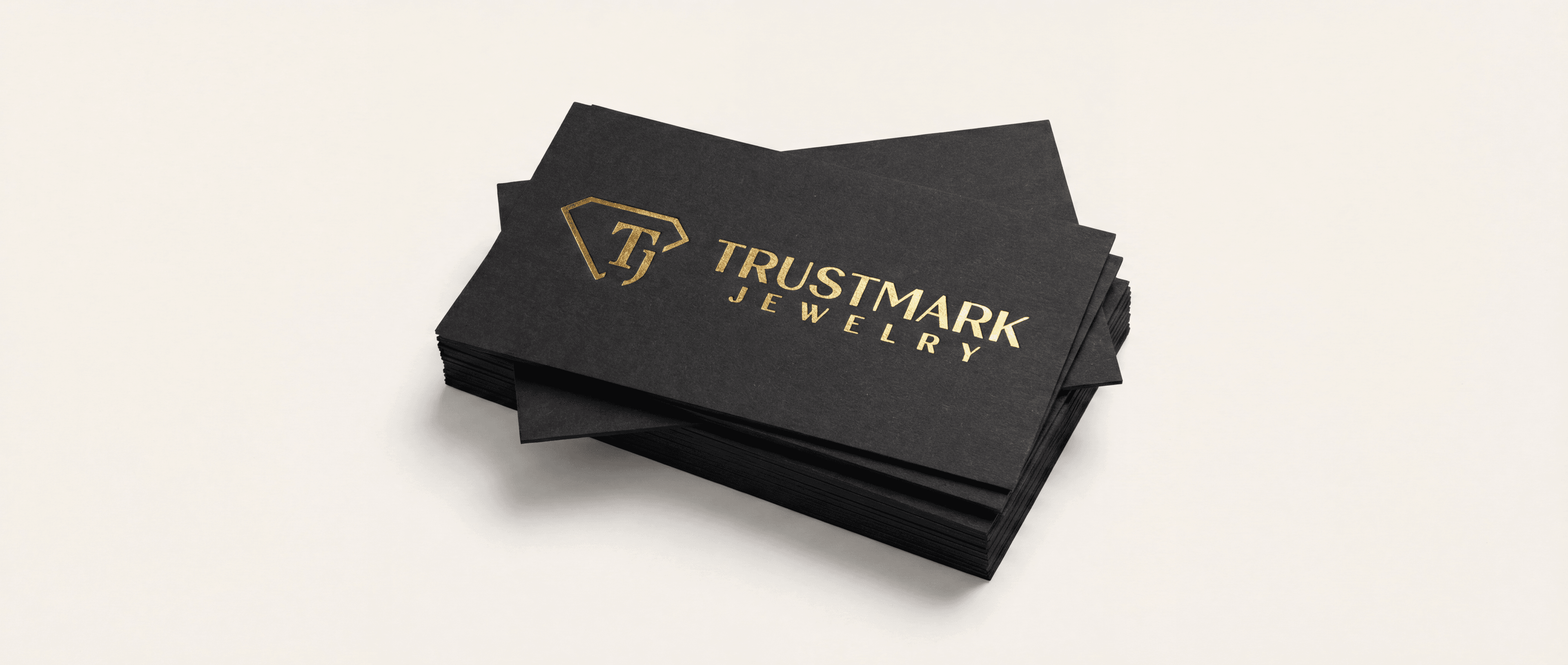
What are gold foil business cards?
Gold foil business cards are cards with a thin layer of metallic foil on part of the design. The foil sits on top of the card where you tell it to go, usually a logo, a name, or a border. The rest of the card is printed with normal ink.
Foil is not gold ink. Metallic ink has tiny flakes in it and looks a little shiny at best. Foil is a real metal-look film, so it reflects light like a ring or a watch. When someone tilts the card, the foil flashes. That small moment is the whole reason people pay more for it.
Foil works best as an accent. A gold logo on a black card, a silver name on navy, or a copper line on cream all look sharp. A card covered in foil tends to look busy and is harder to read.
Which foil colors can you choose?
Gold is the most popular, but it is far from the only choice. Our foil business cards come in 11 foil colors.
The shiny metals: gold, silver, rose gold, and copper. These are bright and mirror-like.
The shiny colors: blue, red, and black. Black foil on a black card is a quiet, high-end look that only shows when light hits it.
The matte metals: matte gold and matte silver. These have a soft sheen instead of a mirror shine. They read as calm and modern.
Holographic: a rainbow shift that changes as the card moves. It is loud in a fun way, good for creative and beauty brands.
Custom color: if your brand has its own color, you can ask for it, and we match it with you on the proof.
Not every color is offered with every option on the order page. The page only shows the combinations we can make, so pick your color first and the rest will follow.
Flat foil vs raised foil: what is the difference?
There are two common kinds of foil on business cards, and it is worth knowing which one you are buying.
Flat foil sits flush on the card. It shines, but when you run a finger over it, it feels about the same as the rest of the card. This is the classic foil look.
Raised foil is built up on a clear raised layer first, then foiled on top. You can feel it as a small bump. It adds a touch you can feel, and it usually costs more.
We want to be plain about this: our foil cards use flat foil. We do not sell raised foil. If you need that raised feel, ask the printer you are comparing whether their foil is raised or flat before you order, because photos rarely show the difference.
For most cards, flat foil is all you need. The shine is what people notice first, and a soft-touch card already gives the card a feel that stands out.
What card stock works best for foil?
Foil looks best on thick, smooth card. Thin paper bends, and the foil can crack along a crease. Rough paper breaks up the shine.
Our foil cards are printed on thick 16PT card with a soft-touch finish. Soft-touch is a coating that feels smooth and a little velvety, almost like suede. It also makes colors look deeper and more matte, which makes the foil pop even more by contrast.
Dark backgrounds make foil stand out the most. Black, navy, deep green, and burgundy cards make gold and silver look bright. Light cards work too, especially with copper, rose gold, or black foil, but the effect is softer.
You can print full color on the front only or on both sides, and put foil on the front or on both sides. Corners can be square, rounded on all 4, or rounded on 2 opposite corners, depending on the color and quantity you pick. Quantities on the order page run from 250 to 5,000 cards.
How do you set up a file for foil business cards?
Foil needs its own file. The printer has to know exactly where the foil goes, and color alone cannot tell them. Here is the usual setup.
Make your normal card design first, front and back, with your colors.
Then make a second file for each side that gets foil. In it, everything that should be foil is solid 100% black. Everything else is white. No grays, no gradients, no soft shadows. Foil is either on or off, so the file must be too.
Use vector art for foil when you can, from Illustrator, Affinity, or a PDF your designer exported. Vector edges stay crisp at any size. If you only have a picture, make it as sharp as you can.
Line the two files up exactly. The foil file must be the same size and position as your design, so the foil lands on the right spot.
Avoid very fine details in foil. Hairline strokes and tiny text can fill in or break. Keep foil lines and small type a bit heavier than you would in ink.
If this sounds like a lot, send your logo and tell us what should shine. We check foil files before printing, and you approve a proof first.
Are foil business cards worth it?
For a lot of businesses, yes. A business card is often the first thing a new client holds from you. Foil makes it feel like a choice, not an afterthought. Jewelers, salons, real estate agents, lawyers, photographers, and restaurants use foil for exactly that reason.
It is not for everyone. If you hand out cards by the thousands at trade shows, or your card is mostly a list of contact details, a plain card may serve you just as well for less money. Our standard business cards are a good fit there.
A simple test: will the person who gets your card judge the quality of your work by it? If yes, foil is a small cost for a strong first touch. Start with one foil element, usually your logo, on a dark soft-touch card, and keep the rest clean.